Branding a product that’s rebranding obituaries
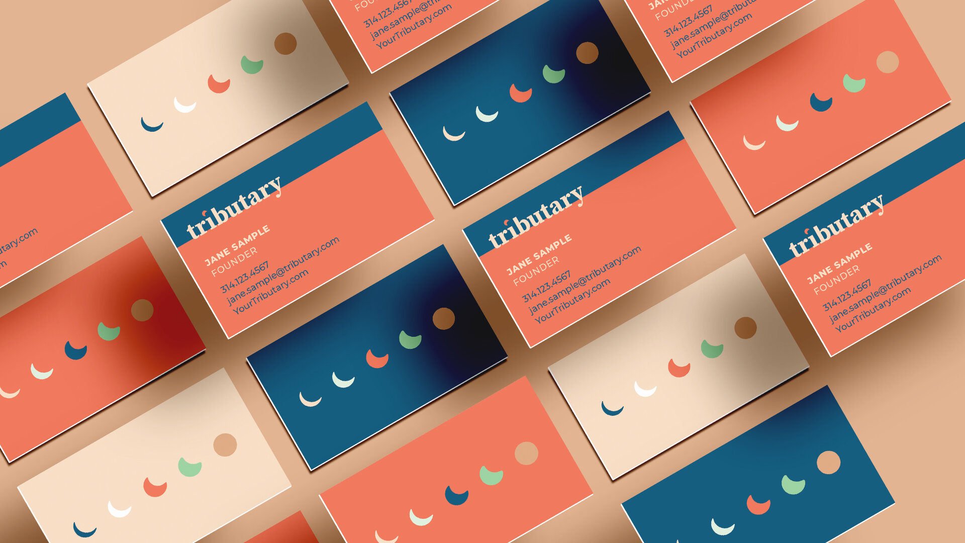
Not only did this product give me some insight into the world of start ups, it was also a design challenge to focus on a target audience that is going through something so heavy and wrought with emotions. Because of this, I used soothing colors, shapes and fonts. I also used circles to symbolize that they’re creating a community.